The Paint Colors Going Out of Style in 2026 (Repaint Before They Date Your Home)
Paint is the cheapest thing in a house to change and the most expensive thing to get wrong, because getting it wrong means living inside the mistake. It is also the surface that dates fastest, since a color that felt current in 2019 does not slowly fade out of fashion — it stays exactly the same while everything around it moves.
The 2026 out list has a clear pattern, and the pattern is more useful than the individual names. Every shade being retired is cool. Every replacement is warmer. Once you see that, you can diagnose your own walls without a trend article.
The short answer. According to 2026 trend coverage from Homes & Gardens and Hunker, the paint colors being retired are cold bright whites, icy blue-grays, and heavy burgundy and oxblood. The replacements are consistently warmer: soft warm white, warm taupe and greige, and earthier reds. The shift is about temperature rather than hue — the same color family, moved a few degrees toward warm.
What paint colors are going out of style in 2026?
Four groups, roughly in order of how many homes they affect.
Cold bright white. The biggest one by surface area. This is the stark, blue-based white that went on walls, trim and ceilings in the same tin because it photographed clean and felt like a safe non-decision. Under generous southern light it can still work. Under low winter light, in a north-facing room, or under any modern cool LED, it reads clinical — closer to a waiting room than a home. It is the single most common reason a room feels cold without anyone being able to say why.
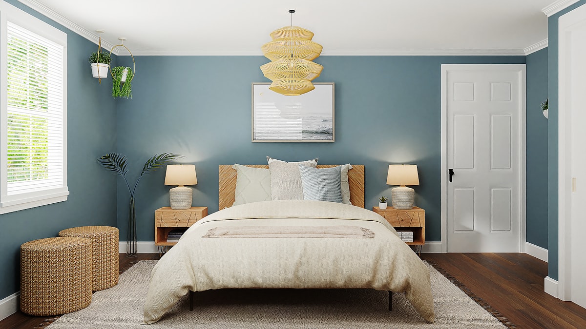
Icy blue-gray. The direct descendant of the gray decade. Where warm greige survived the shift, its cooler cousin did not. Blue-gray has the specific problem of shifting toward lilac in north light, which is a color almost nobody chooses deliberately. If your gray walls look faintly purple on an overcast afternoon, that is the shade in question.
Heavy burgundy and oxblood. A more recent casualty, and a more surprising one, because deep red had a genuine moment. What is being retired is the cool, wine-toned version — the blue-leaning burgundy that goes muddy under warm bulbs. Deep red itself is very much alive; it has simply moved warmer, toward brick, rust, oxide and terracotta.
Cool greige leaning gray. Not a headline casualty so much as a slow one. Greige survived, but the 2026 version leans clearly more beige than gray. The older greiges, mixed to sit closer to the gray end, are quietly aging into the same category as the walls they replaced. We covered exactly where that line falls in what’s replacing gray in 2026, which is worth reading if greige is what you currently have.
What is in versus what is out
| Going out | Going in |
|---|---|
| Cold bright white with a blue undertone | Soft warm white — cream, greige or faint yellow underneath |
| Icy blue-gray | Warm taupe, mushroom, stone |
| Heavy cool burgundy and oxblood | Brick, rust, terracotta, warm oxide red |
| Cool greige mixed toward gray | Greige mixed clearly toward beige |
| Cool charcoal accent walls | Warm deep browns, chocolate, espresso |
| Stark white trim against colored walls | Trim in a warmer white, or color-drenched to match the wall |
Read that table as pairs rather than a list. Almost nothing is being abandoned — every row is the same idea, rotated toward warm.
Why does the temperature matter more than the color?
Because a room does not read as “the wrong shade of white.” It reads as cold, or unfinished, or somehow not as nice as it was in the photos, and most people cannot locate the cause.
The reason is that undertone compounds. Cold white on the walls is survivable. Cold white on the walls, cold white on the trim, cold white on the ceiling and a cool gray floor underneath is not a color choice, it is a temperature, and it is the temperature of a rental listing. The room is not dated because any one surface is dated. It is dated because five surfaces agree with each other.
This is why the fix is usually smaller than people expect. Warming one of the surfaces — most often the walls — normally does enough. You are not correcting a color, you are breaking up a consensus.
There is a two-minute diagnostic that needs no equipment. Hold a sheet of ordinary printer paper flat against the wall in daylight. Printer paper is a near-neutral cool white, so it works as a reference. If your wall reads yellow or brown against it, the wall is warm and it is fine. If it reads blue, gray or faintly lilac, that is the version on the out list. Do the same test against the trim, then the ceiling. If all three read cool, you have found your room’s problem.
Why is winter the window to repaint?
The urgency here is practical, not manufactured.
Low light is diagnostic light. A cold white looks acceptable in June and obviously wrong in January. Winter light — short, flat, mostly overcast in the northern hemisphere — is the condition under which cool undertones show themselves most plainly. If you want to identify the problem accurately, the darkest quarter of the year is when the walls tell the truth.
Booking is easier. Interior painting is indoor work and runs all year, but demand is seasonal and the stretch between the holidays and spring is typically the quietest for decorators. The same job scheduled in April competes with everyone else who decided their house needed attention once the light came back.
Finished before the season that matters. Whatever you use the house for in spring — entertaining, photographing, listing, hosting — a winter repaint is dry, cured and settled by then. A spring repaint means living in a half-empty room during the exact weeks you wanted it finished.
The ranges are freshest. Paint brands announce their colors of the year in the autumn, which means the warm neutrals now dominating the 2026 lists are at their widest availability in samples and stock through the following winter.
None of that means a cold white becomes an emergency. It means that if you were going to do it anyway, the next few months are the cheapest and least disruptive version of doing it.
Which room should you repaint first?
Order by how cold the room currently feels and how much you use it, not by size.
North-facing rooms first. They receive the coolest, most consistent light in the house, which means every cool undertone in them is amplified. A north-facing bedroom in cold white is the most improvable room in most homes.
Rooms used mainly after dark second — dining rooms, snugs, bedrooms. These live under warm artificial light, which fights with cool paint and produces the muddy, slightly grubby look people mistake for dirty walls.
Hallways and stairs last. They have the least natural light and the most surface area, which makes them expensive per unit of improvement, and they are usually the room people notice least.
Testing before you commit two coats
The failure mode with warm neutrals is specific and extremely common: people pick the right family and the wrong undertone. A taupe that looks perfect on a five-centimeter chip can go distinctly pink across four meters of north-facing wall, and by the time you know, you have bought the paint and lost the weekend.
Chips are unreliable for one structural reason — they are too small to show you how a color behaves at scale, and neutrals change more with scale than any other family. Tester patches are better but still misleading, because a patch of warm white surrounded by cold white will always look warm.
The step that actually resolves it is seeing the whole wall, in your room, with your furniture and your light, before anything is bought — which is what Architectural AI is for. Photograph the room, then apply warm white, greige, taupe and clay to it in turn and look at which one stops the space feeling cold. It takes about as long as reading a color chart, and being wrong four times costs nothing. The styles gallery shows the 2026 replacement neutrals applied across full rooms rather than as swatches, which is the only view that answers the question.
If you want the other half of the picture — the shades people are actively choosing rather than the ones they are leaving — the most popular paint colors right now covers what is going on walls in 2026. The out list and the in list are best read together, because the gap between them is where most repaint mistakes happen. Plan details are on the pricing page.
The colors on the out list were not bad choices. They were the safe choices of a decade that has ended, and safe choices are exactly the ones that date, because everybody made them at once.
FAQ
What paint colors are going out of style in 2026?
According to 2026 trend coverage from Homes & Gardens and Hunker, the main casualties are cold bright whites, icy blue-grays, and heavy burgundy and oxblood. The replacements named across the same coverage are consistently warmer: soft warm whites, warm taupe and greige, and earthier reds like brick and terracotta.
Is white paint out of style?
Cold, blue-based white is. Bright white with a blue or gray undertone reads clinical under low winter light. Warm whites carrying cream, greige or a faint yellow undertone are still the most widely used interior color and are not going anywhere.
Is burgundy out of style in 2026?
Heavy, cool-toned burgundy and oxblood are named in 2026 out lists. Deep red has not disappeared, but the current version is warmer and earthier — brick, rust, terracotta and warm oxide rather than wine.
When is the best time to repaint interior walls?
Winter, for three practical reasons. Low daylight shows cold undertones at their most obvious, so you diagnose the problem accurately. Painters are typically easier to book between the holidays and spring. And the room is finished before the season when people entertain, list or photograph their homes.
Keep reading