The Unexpected Red Theory: TikTok's Most Viral Room Trick Still Works in 2026
Every so often a piece of design advice escapes the design world and becomes something ordinary people repeat at dinner parties. The unexpected red theory is one of them. It arrived through TikTok, it sounded too simple to be real, and every serious designer who tested it came back saying the same thing: it works.
Two years on, the interesting question is not whether it works. It is why the thing that was supposed to be a passing internet moment is still being cited by editors and designers in 2026, and what the people getting it wrong are actually getting wrong.
The short answer: the unexpected red theory says any room improves when you add a single red object with no logical reason to be there. Not a red scheme, not red accents plural — one red thing that matches nothing. It survives because it is not really about red. It is about giving an over-coordinated room one deliberate interruption.
What is the unexpected red theory, exactly?
The phrase entered circulation through TikTok, where an interior designer used it to describe something she kept noticing in rooms she admired: there was almost always something red in them, and it almost never made sense.
That last part is the whole rule. The red is not pulled from a cushion. It does not echo a rug. It is not tied into a palette anywhere else in the room. A red kitchen timer on a shelf of neutral ceramics. A red-spined book left face-out. A single red glass tumbler on an otherwise white table. A red pull cord on a linen blind.
Design writing usually tells you to repeat an accent colour at least three times so it reads as intentional. The unexpected red theory does the opposite and works anyway, which is why it caught on. It gives people permission to stop hunting for the fourth thing to match.
The mechanism is straightforward once you see it. A well-coordinated room is a closed system — every element explains every other element, and the eye has nowhere to catch. One unjustified red object breaks the loop. It reads as evidence that a person lives there and made a choice, rather than that a scheme was executed.
Why did designers say it would fade, and why hasn’t it?
Trend cycles usually kill a viral idea by saturation. The advice gets repeated until every room on the internet has the same red stool in the same corner, and then it becomes shorthand for trying too hard.
That has not quite happened. According to Homes & Gardens, which ran a one-year-on follow-up on the trend, designers were still endorsing it well after the initial wave, describing it as having evolved rather than expired. TikTok, for its part, continues to maintain a dedicated discover page for the term — the platform’s own signal that people are still searching it rather than moving past it.
The reason it survived is that it is unusually cheap to be wrong about. Most trends demand a purchase you cannot undo — a paint colour, a sofa, a tile choice. This one asks for an object you can move to another room or put back in a drawer. The downside risk is close to zero, so the advice keeps circulating instead of collapsing under regret posts.
It has also quietly broadened. The 2026 version is less about the literal viral objects — the red kettle, the red lampshade — and more about the principle: a single saturated interruption in an otherwise resolved room. Some designers now run the same play with cobalt or acid green. Red remains the default because it is the colour the eye finds fastest.
Where does the red actually go in a room?
The placement matters more than the object. Four positions work reliably.
In the sightline, not the centre. The red should be somewhere your eye lands on the way to something else — the edge of a shelf, the far end of a console, beside a doorway. Dead centre on a coffee table reads as staged.
At a different height from everything else. If your room’s visual weight sits at sofa height, put the red low on the floor or high on a shelf. The height change does half the work.
Against your largest quiet surface. A red object on a busy patterned rug disappears. The same object against a plain wall, a linen sofa or a bare worktop is what people photograph.
Somewhere functional. The strongest examples are objects with a job — a kettle, a phone, a stool, a fire extinguisher left visible on purpose. Purely decorative red asks to be judged as decoration. Useful red gets a pass.
What counts as red, and what backfires?
Not all reds behave the same way, and the failures are consistent enough to list.
| Works | Backfires |
|---|---|
| One object, unrepeated | Red repeated three times “for balance” |
| Saturated true red, cherry, tomato, lacquer red | Muted brick, terracotta, dusty rose — these read as palette, not interruption |
| Something with a function | A red decorative bowl with nothing in it |
| Small relative to the room | A red armchair, which becomes the room’s subject |
| In a quiet, low-contrast space | In a room that already has a loud focal wall |
| Slightly awkward placement | Perfectly centred and symmetrical |
The muted-red failure is the one that catches most people. Terracotta and dusty rose are lovely, and they are currently everywhere in warm neutral schemes — which is precisely why they cannot do this job. They blend. The theory needs a colour that refuses to blend.
The other frequent mistake is scale. A red accent chair is not the unexpected red theory. It is a red accent chair, and it now needs the rest of the room to accommodate it. The trick depends on the red being small enough that the room does not have to reorganise itself around the intrusion.
Which rooms take it best?
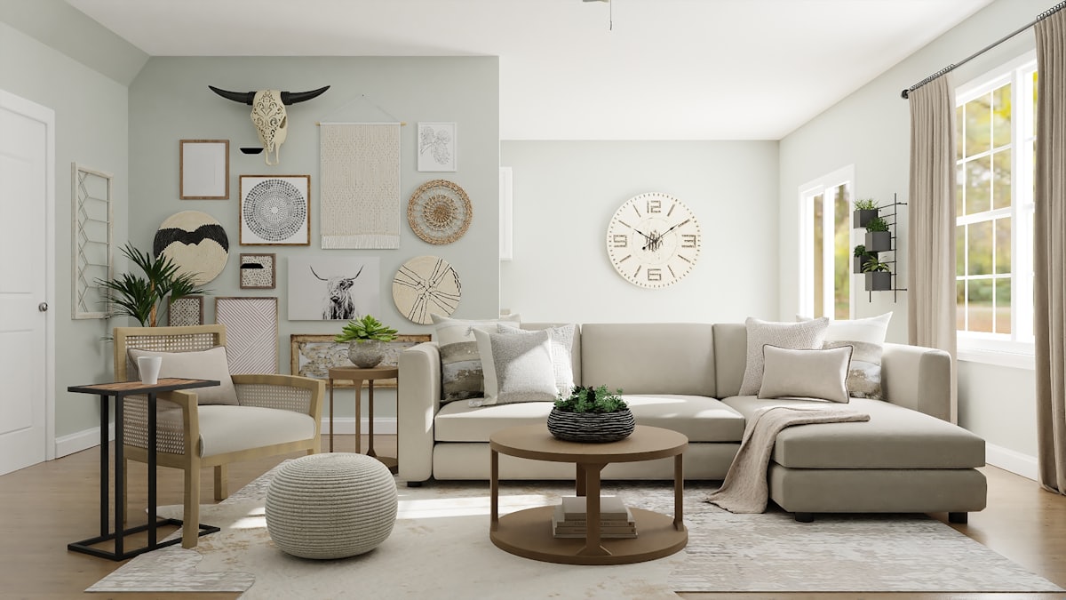
Rooms that are almost too tasteful. If your space is beige, greige, warm white, Japandi, or Scandinavian — the exact schemes that have dominated the last few years — you are the primary target for this. Those rooms are correct and slightly airless, and one red object fixes that faster than any amount of texture layering.
All-white kitchens are the single best host. A red kettle, a red stool, a red dish rack against white cabinetry is the cleanest version of the whole idea, and it costs less than a set of new handles.
Home offices work well because they are full of functional objects that come in red anyway — a stapler, a chair cushion, a cable, a mug. Bedrooms are the hardest, because red is stimulating and bedrooms are not supposed to be. If you want it there, put the red low and out of the sightline from the bed.
Rooms that resist it: anywhere with a strong existing focal point, and any space already running a warm accent. Red next to orange or hot pink stops being unexpected and starts being an argument.
How do you test red without buying red?
Red is the highest-risk colour to buy on instinct. The gap between a cherry red that lifts a beige room and a brick red that just sits there is small on a screen and enormous in person, and shops rarely let you take a lamp home to check.
This is the specific problem worth solving before you spend anything. Photograph the room, add the red object where you are considering it, then move it — the shelf, the floor, the console, the doorway — and see which position your eye actually goes to. Then try the variations that are hard to judge in the abstract: true red against your walls versus cherry versus lacquer, small versus slightly larger, one object versus the two you were tempted by.
Architectural AI does this from a single photo of your own room, which is the only version of the test that means anything — your light, your walls, your existing furniture. The styles gallery shows how the same principle plays out across different base schemes, and the gallery is useful for calibrating scale before you commit to a size.
Ten minutes of previewing usually settles two questions at once: whether your room wants red at all, and whether the object you had in mind is too big.
The part people miss
The unexpected red theory is not a colour trend. It is a rule about over-resolution, and red is just the fastest available tool.
Which means the useful takeaway outlives the hashtag. If a room feels finished but flat, it does not need another textured cushion or a third wood tone. It needs one thing that does not belong, placed slightly wrong, in a colour that refuses to cooperate.
That is why it is still being written about in 2026. It was never really advice about red.
FAQ
What is the unexpected red theory in interior design?
It is the idea that almost any room gets better when you introduce a single red object that does not match anything else in the space. The red is not part of the palette and is not repeated elsewhere. Its job is to interrupt the room, not to coordinate with it.
Is the unexpected red theory still a trend in 2026?
Yes. Homes & Gardens published a one-year-on follow-up finding that designers still endorse it, and TikTok continues to run a dedicated discover page for the term. It has moved from viral moment to standard styling advice, which is usually the sign a trend has stopped being a trend.
How much red should you add to a room?
One object. The theory depends on the red being singular and unjustified. A red lamp plus red cushions plus a red throw is a red colour scheme, which is a different and much harder look to pull off.
Does the unexpected red theory work with any colour scheme?
It works best against quiet, low-contrast rooms — beige, greige, warm white, Japandi, Scandinavian. It struggles in rooms that already have a loud focal point or a competing warm accent like orange or hot pink, where the red becomes one voice in an argument rather than the only one.
Keep reading