Colour Psychology in Interiors: What Each Colour Really Does
Most colour-psychology writing is a list of confident claims: blue calms you, red raises your appetite, yellow makes babies cry. Very little of it survives contact with the actual research, and none of it survives contact with the fact that your grandmother’s kitchen was yellow and you find yellow comforting.
What follows separates the parts that hold up from the parts that do not, then gets practical.
What the evidence actually supports
Three findings are reasonably robust:
- Saturation and brightness drive arousal more than hue does. A vivid colour of any hue is more stimulating than a muted one. This is the most useful single fact in the field, and it is why “should I use blue or green in the bedroom” is a much less important question than “how saturated should it be”.
- Warm and cool are consistently perceived. People reliably describe reds, oranges and yellows as warm and blues and blue-greens as cool, across cultures. The effect on perceived room temperature is real but modest.
- Preference is highly individual and shaped by association. Personal memory and cultural context routinely outweigh any general rule.
What is much weaker than the internet suggests: precise physiological claims (a specific blue lowering heart rate), productivity claims tied to a single hue, and appetite claims about red in restaurants. Treat these as folklore that occasionally happens to be useful, not as design law.
The practical consequence: use colour psychology to generate a shortlist, then test the shortlist in the actual room. The honest version of this advice is in how interior design affects your mood, which covers light, clutter and nature alongside colour.
Colour by colour
| Colour | Commonly associated with | What it tends to do in a room | Works well in | Watch out for |
|---|---|---|---|---|
| Blue | Calm, distance, cleanliness | Recedes visually; reads cool and quiet | Bedrooms, bathrooms, offices | Goes cold and clinical in north light; needs a warm counterweight |
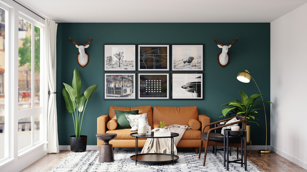
| Green | Nature, balance, restfulness | The easiest colour to live with; low arousal at any lightness | Any room; especially bedrooms and offices | Bright yellow-greens are far more stimulating than sage |
| Grey | Neutral, sober | Depends entirely on undertone — blue-grey chills, warm grey softens | Living rooms, hallways | Cool greys look flat under warm bulbs; the reason “greige” replaced grey |
| Beige, cream, taupe | Warmth, ease | Recedes without cooling; forgiving under any light | Anywhere | Reads bland without texture; it needs materials, not more beige |
| White | Clean, open, minimal | Maximises light and contrast; shows every edge | Small rooms, galleries, ceilings | High contrast with trim and furniture makes rooms feel smaller, not bigger |
| Brown, clay, terracotta | Earth, comfort, shelter | Warm and enclosing; flattering to skin and wood | Living rooms, dining rooms | Can go heavy without a light contrast |
| Yellow | Energy, light, cheer | High-arousal at saturation; gentle when muted | Kitchens, hallways, accents | Saturated yellow on all four walls is exhausting; butter and ochre are fine |
| Orange | Sociability, warmth | Strongly warm and forward-coming | Dining rooms, accents | Very hard to live with at full saturation |
| Red | Intensity, urgency | Advances visually, shrinks a room, high arousal | Dining rooms, accents, a single wall | The riskiest colour to commit a whole room to |
| Pink | Softness, warmth | Behaves like a light warm neutral at low saturation | Bedrooms, living rooms | Bright pink is a saturation decision, not a colour one |
| Purple | Luxury, imagination | Reads cool or warm depending on whether it leans blue or red | Bedrooms, studies | Mid-purples date quickly; deep aubergine is more durable |
| Black | Depth, drama, definition | Absorbs light, creates edges, makes other colours sing | Accents, joinery, one wall, small rooms | Needs enough light; kills a room with a single north window |
The single most useful pattern in that table: the muted version of almost any colour is livable, and the saturated version of almost any colour is a commitment. If you are unsure, drop the saturation, not the colour.
Undertone matters more than the name
Two paints called “warm white” can be one pink-leaning and one green-leaning, and they will fight different things in your room. Undertone is what makes a colour work or clash with the floor, the worktop and the sofa you already own.
The practical test: put the sample next to a sheet of pure white paper. Whatever hue you suddenly notice is the undertone. Then check it against the fixed elements — the floor tone, the tiles, the kitchen worktop — because those are not changing and they will win any argument.
Light rewrites every colour
Colour is only reflected light, so the light source is half the decision.
| Room orientation (northern hemisphere) | Light | Colours that work |
|---|---|---|
| North-facing | Cool, indirect, constant | Warm-leaning: cream, clay, warm greige, olive. Cool greys go grim |
| South-facing | Warm, direct, bright | Almost anything; cool colours stay balanced |
| East-facing | Warm early, cool later | Warm neutrals; colours shift noticeably through the day |
| West-facing | Cool early, warm and intense late | Muted colours; strong hues become overwhelming at sunset |
Reverse north and south in the southern hemisphere.
Artificial light matters just as much, because most rooms are used after dark. A wall under a 2,700K bulb and the same wall under a 4,000K bulb are, for practical purposes, two different colours — the warm bulb amplifies yellows and reds and greys out blues, the cool one does the reverse. Standardise the bulbs before you finalise the paint; the lighting by the numbers guide covers which Kelvin belongs in which room.
Room by room
Bedroom. Low saturation, whatever the hue. Soft blue, sage, warm grey, clay and mushroom are the reliable set. Deep and dark also works well — a bedroom in charcoal or ink reads as enclosing rather than stimulating, and it hides the room’s edges, which is why small dark bedrooms often feel bigger than small white ones. Calming bedroom ideas for better sleep goes further into this.
Living room. The room that has to work in daylight and lamplight, for reading and for guests. Warm neutrals with one committed accent is the durable formula. If you want drama, put it on one wall or in the joinery rather than all four walls — see accent wall ideas.
Kitchen. Colour here mostly means cabinetry, which is expensive to change, so the base wants to be durable: off-white, muted green, deep blue, warm wood. Save the fashionable colour for something replaceable.
Dining room. The one room where warmth and even a bit of drama genuinely earn their place, because it is used at night, under lamplight, for a couple of hours at a time. Deep reds, greens and blues all work here in a way they would not in a home office.
Home office. Muted green or blue-green: low arousal, easy over long sessions, no competition with a screen. Avoid stark white beside a monitor. Home office design ideas covers the rest of the setup, and video call background design covers what the camera sees.
Bathroom. Light and cool reads clean; warm and dark reads like a hotel. Both are valid — decide which of the two you want before choosing tile. Spa bathroom ideas sits at the warm end of that choice.
Kids’ room. Saturated colour is stimulating, which is fine for a playroom and counterproductive at bedtime. The usual solution is a calm base with saturated colour in the changeable layer — bedding, art, storage boxes. Kids’ rooms that grow with the child treats this as a durability problem.
Building a palette that holds together
60-30-10. Roughly 60% dominant (walls, large surfaces), 30% secondary (upholstery, curtains, rug), 10% accent (cushions, art, one object). The value is not the exact ratio; it is that it forces a hierarchy. Most failed palettes are three colours competing at equal weight.
Three additions that do most of the remaining work:
- Repeat every colour at least twice in a room, or it reads as an accident rather than a decision.
- Carry one thread through the whole home. A shared undertone or a repeating accent makes rooms feel like one house — the whole-house colour scheme guide has the method.
- Count materials as colours. Oak is a warm mid-tone; brass is a saturated yellow; black metal is an accent. A “neutral” room with five wood tones is not neutral.
The test that settles it
Every rule above is a hypothesis about your specific room, with your specific light, floor and furniture. There is only one way to check it, and a paint chip is not it — a 10 × 10 cm square tells you nothing about what an entire room in that colour feels like.
Architectural AI repaints a photo of your actual room in any shade, so you can compare a muted sage, a deep ink and a warm clay on your own walls, in your own light, with your own sofa in frame. It takes seconds per option, which means you can test the version you are afraid of as easily as the safe one. Test paint colours on a photo of your wall is the step-by-step, and most popular paint colours is a shortlist to start from.
Frequently asked questions
What colour is best for a bedroom?
Muted, low-saturation colours are the safest choice: soft blues, sage and olive greens, warm greys, clay and mushroom tones. What matters more than the hue is the saturation — a chalky sage and a dusty blue both work, while the same colours at full intensity do not. Deep, dark colours also work very well in bedrooms because they blur the room’s edges and read as enclosing rather than stimulating.
Does colour psychology actually work in interior design?
Partly. There is reasonable evidence that saturated, bright colours are more arousing than muted ones, and that warm and cool hues are consistently described as such. There is much weaker evidence for specific claims like a particular blue lowering blood pressure or yellow causing arguments. Personal association and cultural context routinely outweigh any general effect, so use colour psychology as a starting hypothesis and your own reaction as the decider.
What colours make a room look bigger?
Light, low-contrast schemes read as more open, because the eye finds fewer edges to measure the room by. But the stronger lever is contrast, not lightness — a small room painted one colour from wall to ceiling including the trim feels larger than the same room in white with dark skirting boards. That is why deep colours can work surprisingly well in small spaces: they hide the corners rather than outlining them.
What is the 60-30-10 rule?
Split a scheme into roughly 60% dominant colour (walls and large surfaces), 30% secondary (upholstery, curtains, a large rug) and 10% accent (cushions, art, a single piece of furniture). It works because it forces a hierarchy — most failed palettes are three colours competing at equal weight. Treat the numbers as approximate; the point is one clear winner, one supporting colour and one small voice.
Why does my paint colour look different at home?
Because of light. Colour is only what a surface reflects, so the light source changes it: a warm white under a 2,700K bulb reads cream and under a 4,000K bulb reads grey. Room orientation matters too — north-facing rooms in the northern hemisphere receive cool, indirect light all day, which pushes every colour cooler and greyer, while south-facing rooms get warm direct light that intensifies everything.
What colour should a home office be?
Muted greens and blue-greens are the usual recommendation and a sensible default: they are low-arousal, easy on the eyes over long sessions, and they do not compete with a screen. Avoid high-saturation colours in your peripheral vision, and avoid stark white if the room is bright, because a white wall beside a monitor creates a contrast your eyes adjust to all day. What the wall does behind you on video calls is a separate question worth answering too.
Keep reading